Point Graph - Scatter Plot
The Point Graph script library supports three different types of interactions: Line Graph, Scatter Plot, and Polygon Graph. This Styleguide example demonstrates how to use the Scatter Plot option of Point Graph.
Scatter Plot interactions are triggered by specifying the following QTI Custom Interaction class attribute:<customInteraction class="tei-pointgraph-scatter" responseIdentifier="RESPONSE">
This customInteraction contains only one element, <customOption>, which describes everything about the scatter plot, including its coordinate plane configuration settings. Inside the configuration
object, just set the graph type to the "scatterPlot" type; e.g., 'graphType':'scatterPlot'. Easy!
Also, don't forget to specify the id of the html element where you want to place the Point Graph. In the following case, our item QTI markup contains a <div id="RESPONSE" />. The following is a complete <customOption> configuration object. Note the 'graphType': 'scatterPlot':
Arrowheads
The lines plotted by the student, or in pre-plotted lines, can be set to include arrowheads (i.e.,
indicating a line as opposed to a line segment with the parameter
'arrowHead'. If this particular parameter is left out, the default value of
'arrowHead': false is used.
In order for the 'arrowHead' parameter to be honored, the 'segmentMode'
parameter needs to be set to false (i.e., below, the answer for Line A is a line, not
a line-segment or a series of connected line-segments; thus, the arrow-heads will display for Line
A.
Origin Label
There is now an option to show or hide the origin label on the graph. The code for this will be showOrigin:true or
showOrigin:false.
Note: This option can only be enabled/disabled if gridType is coordinate.
Line Weights
The weights of the borders and axes of the graph can be changed separately now. The attributes for these are as follows:
- Border Weight :
outerLineWeight - Axis Weight :
axisLineWeight
Add these attributes, followed by a number, to define specific weights for the borders and axes of your graph.
Point Labels
The labels for points can now be hidden on both the x-axis, y-axis or both.
Hiding the point labels is accomplished by adding 'hideLabels': true to the appropriate axis.
Below is an example of an axis with labels hidden:
{'startPoint': 0, 'increment': 1, 'title': 'Time(hr)', 'hideLabels': true}
Descending Axes
The labels for points on the x and/or y-axis can be configured to be in descending order. For example 10, 9, 8, 7, 6...
To have descending point labels, use a negative increment 'increment': -1 on the appropriate axis. Also make sure to define a start point that makes sense 'startPoint': 10
Below is an example of a axis starting at 10 and counting down:
'xAxis': { 'startPoint': 10, 'increment': -1, 'title': 'Time (hr)' }
Ignore Answer
If a scatter plot is inside a composite item there is an option to have the scatter plot be ignored when the answered status of the item is being determined.
To do this, add the class ignore-answered to the interactions class attribute.
Example: <customInteraction class="tei-pointgraph-scatter ignore-answered" responseIdentifier="RESPONSE">
minimumPoints
The minimumPoints property is added onto the pointRules object. This property specifies how many points should be plotted before the item is considered answered.
It will defaut to 1 if the property is not included or is set to 0. This means that by default without the configuration one point will only need to be plotted to consider the item answered.
Example: 'pointRules': { 'minimumPoints': 2, ... }
graphTitle
The optional graphTitle property is added onto the configuration object. This property adds a title to the graph centered in the passage.
Example: 'graphTitle': 'Park Distance and Visit Frequency'
graphTitleCentered
The optional graphTitleCentered property is added onto the configuration object. This property specifies whether the title declared in graphTitle will be centered to the graph or the passage. This
means that by default without the configuration the title will be centered to the passage. If it is set to true, the title is centered to the graph and false means the title is centered to the passage.
Example: 'graphTitleCentered': false
<customOption><![CDATA[
  {
    'div': 'RESPONSE',
    'width': 300,
    'height': 300,
    'graphTitle': 'Park Distance and Visit Frequency',
    'graphType': 'scatterPlot',
    'gridType': 'oneQuadrant',
    'vLines': 10,
    'hLines': 10,
    'segmentMode': false,
    'outerLineWeight': 3,
    'innerLineWeight': 1,
    'plotLineWeight': 6,
    'plotLineColor': '#0000FF',
    'pointRadius': 8,
    'pointHalo': true,
    'pointColor': '#0000FF',
    'splitScreen': true,
    'arrowHead': true,
    'pointRules': {
      'maximumPoints': 6,
      'minimumPoints': 2,
      'allowOuterH': false,
      'allowOuterV': false,
      'xSubIncrement': 2,
      'ySubIncrement': 2,
      'draggable': true
    },
    'xAxis': {
      'startPoint': 0,
      'increment': 10,
      'title': 'Distance to Park (miles)'
    },
    'yAxis': {
      'startPoint': 0,
      'increment': 1,
      'title': 'Number of Visits per Year'
    }
  }
]]></customOption>
| Get Responses: | [ Click Get Responses ] |
<?xml version="1.0" encoding="utf-8"?>
<assessmentItem xmlns="http://www.imsglobal.org/xsd/imsqti_v2p1" xmlns:xsi="http://www.w3.org/2001/XMLSchema-instance"
xsi:schemaLocation="http://www.imsglobal.org/xsd/imsqti_v2p1 http://www.imsglobal.org/xsd/imsqti_v2p1.xsd"
adaptive="false" timeDependent="false"
identifier="customInteraction-pointgraph-scatterplot" title="Plot Zach's Data - Pointgraph - Scatterplot">
<responseDeclaration baseType="string" cardinality="multiple" identifier="RESPONSE">
<correctResponse>
<value>25 1</value>
<value>10 2</value>
<value>35 7</value>
<value>10 3</value>
<value>60 5</value>
<value>20 7</value>
</correctResponse>
</responseDeclaration>
<outcomeDeclaration identifier="SCORE" cardinality="single" baseType="float" />
<itemBody>
<div class="row">
<div class="span6">
<p>
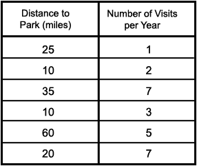
Zach surveyed a group of people visiting state parks to determine if the
distance they lived from the park affected how frequently they visited the park.
</p>
<p>
Zach's data is shown in the table below.
</p>
<div class="center"><img alt="table" src="images/parkTable.png"/></div>
</div>
<div class="span6">
<div class="well">
<p>
Create a scatterplot that correctly represents Zach's data. Click or touch (on iPad) the
grid to place each point.
</p>
<div id="RESPONSE" />
<customInteraction class="tei-pointgraph-scatter" responseIdentifier="RESPONSE">
<customOption><![CDATA[
{
'div': 'RESPONSE',
'width': 300,
'height': 300,
'graphTitle': 'Park Distance and Visit Frequency',
'graphType': 'scatterPlot',
'gridType': 'oneQuadrant',
'vLines': 10,
'hLines': 10,
'outerLineWeight': 3,
'innerLineWeight': 1,
'plotLineWeight': 6,
'plotLineColor': '#0000FF',
'pointRadius': 8,
'pointHalo': true,
'pointColor': '#0000FF',
'splitScreen': true,
'pointRules': {
'maximumPoints': 6,
'minimumPoints': 2,
'allowOuterH': false,
'allowOuterV': false,
'xSubIncrement': 2,
'ySubIncrement': 2,
'draggable': true
},
'xAxis': {
'startPoint': 0,
'increment': 10,
'title': 'Distance to Park (miles)'
},
'yAxis': {
'startPoint': 0,
'increment': 1,
'title': 'Number of Visits per Year'
}
}
]]></customOption>
</customInteraction>
</div>
</div>
</div>
</itemBody>
<responseProcessing
template="http://www.imsglobal.org/question/qti_v2p1/rptemplates/match_correct"/>
</assessmentItem>
Zach surveyed a group of people visiting state parks to determine if the distance they lived from the park affected how frequently they visited the park.
Zach's data is shown in the table below.
Create a scatterplot that correctly represents Zach's data. Click or touch (on iPad) the grid to place each point.